⌘ K Layout
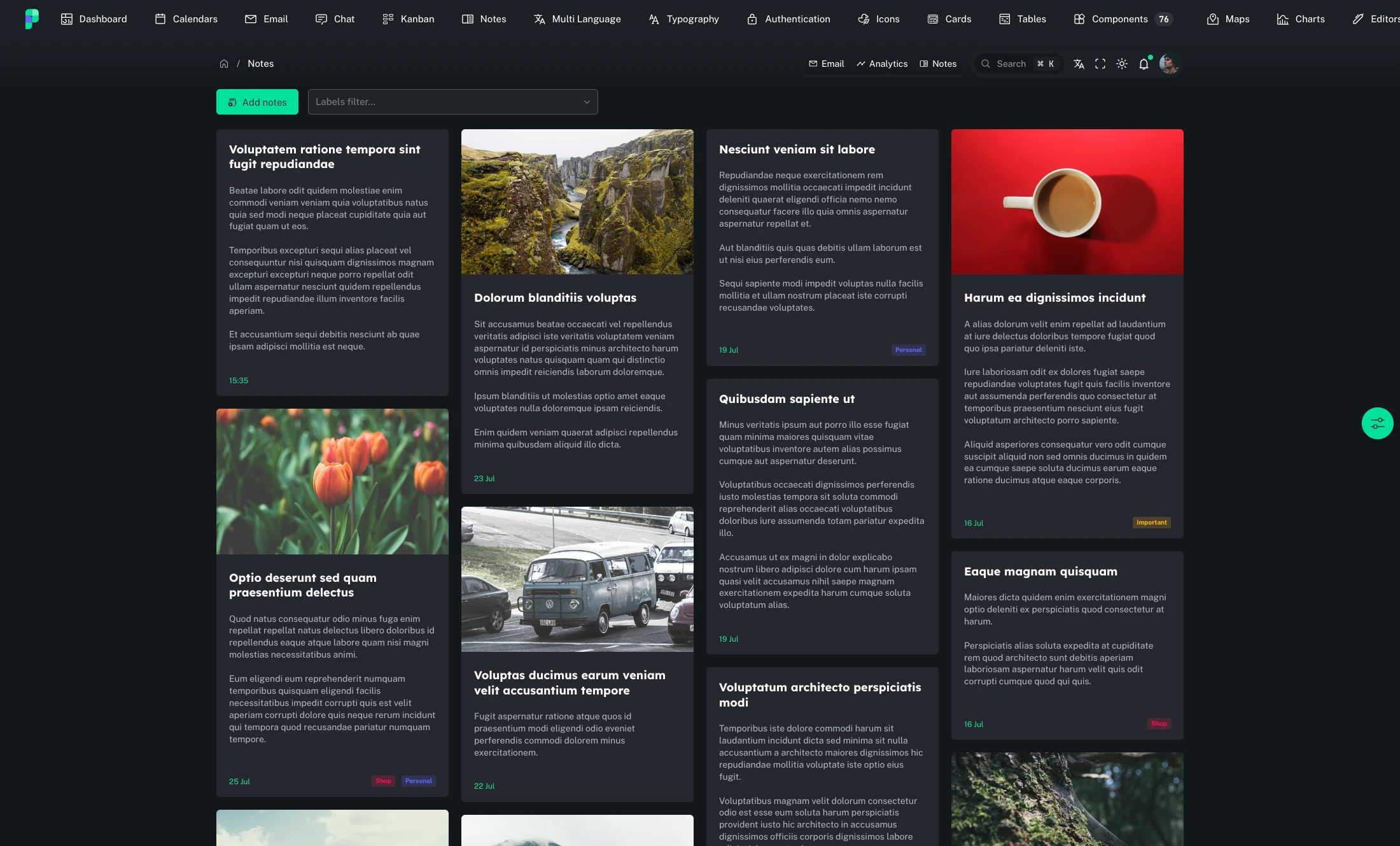
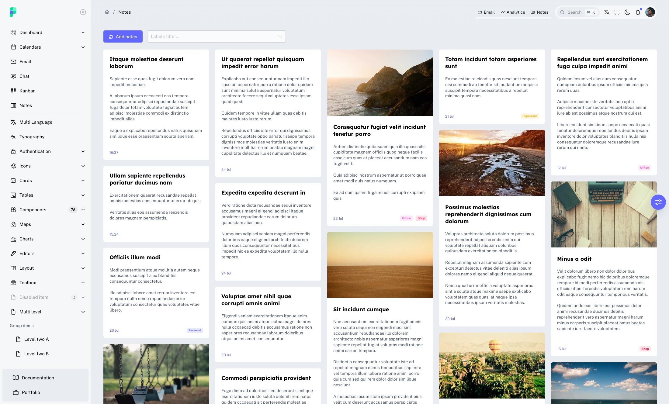
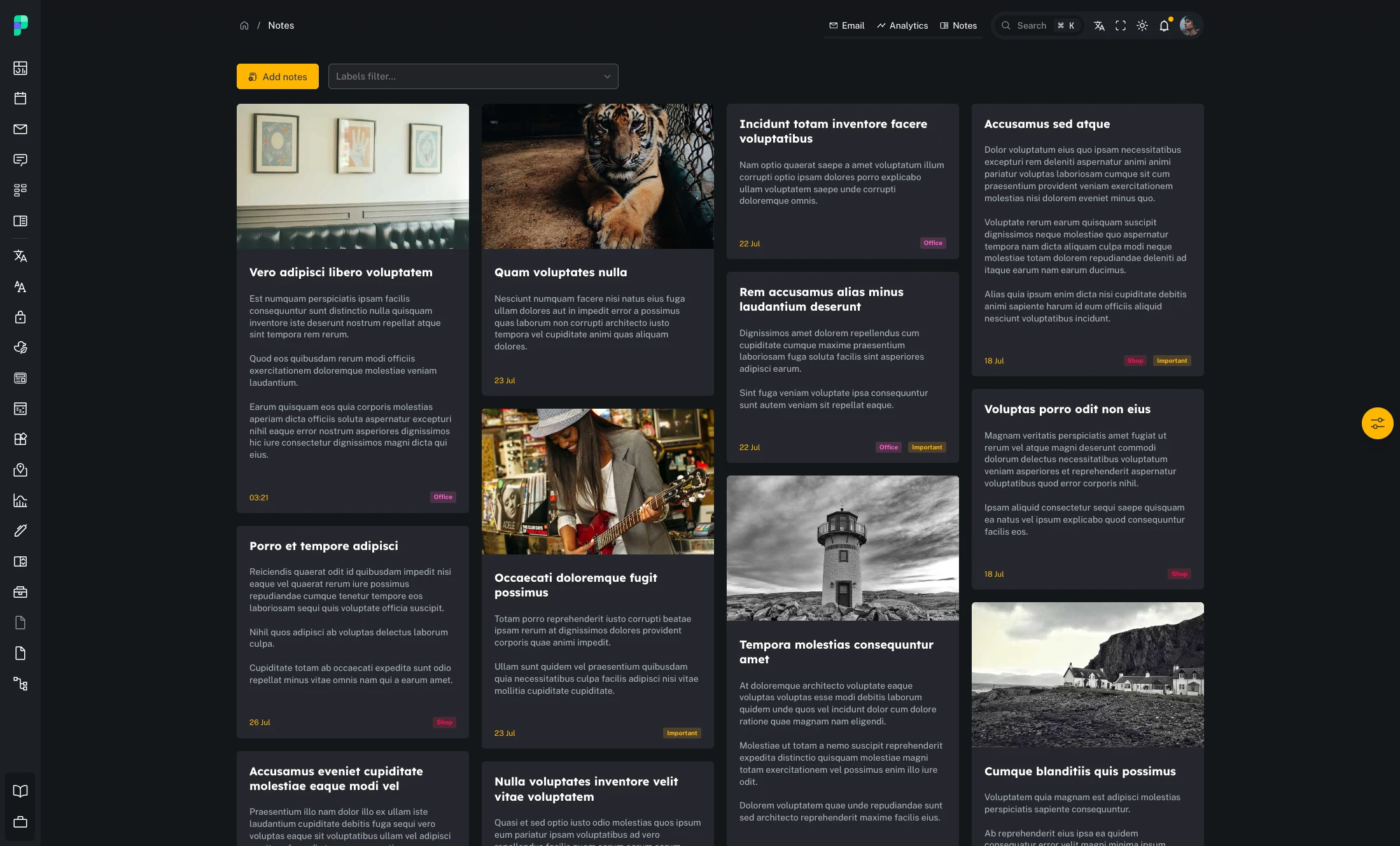
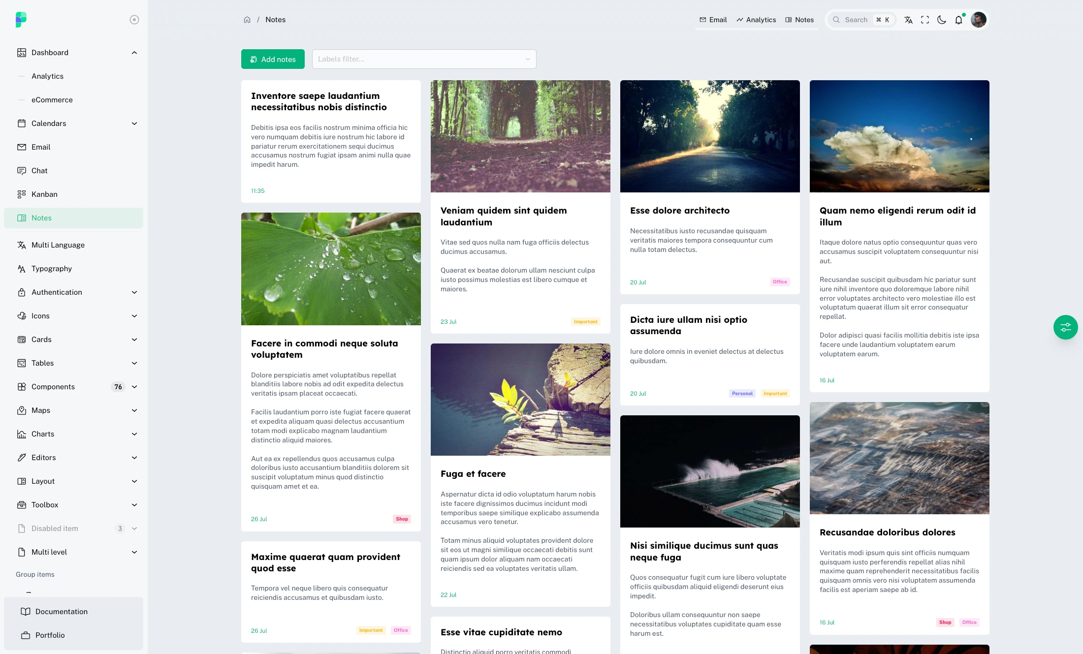
Pinx offers the flexibility to choose between two distinct layout options: HorizontalNav and VerticalNav. Additionally, there is a Blank layout variant specifically designed for pages that do not require elements such as a navigation bar or toolbar.
Moreover, the platform allows users to introduce new layouts or extend the existing ones, thereby customizing the template to align precisely with their unique requirements and preferences. This adaptability empowers users to craft a tailored layout that seamlessly integrates with their specific application needs.
Here are some examples of layouts:
The template layouts provide a robust foundation for customization, but it's essential to highlight that they are not the only available option. In addition to the layouts, there are other customization features that can be leveraged to tailor the application's appearance based on user preferences.
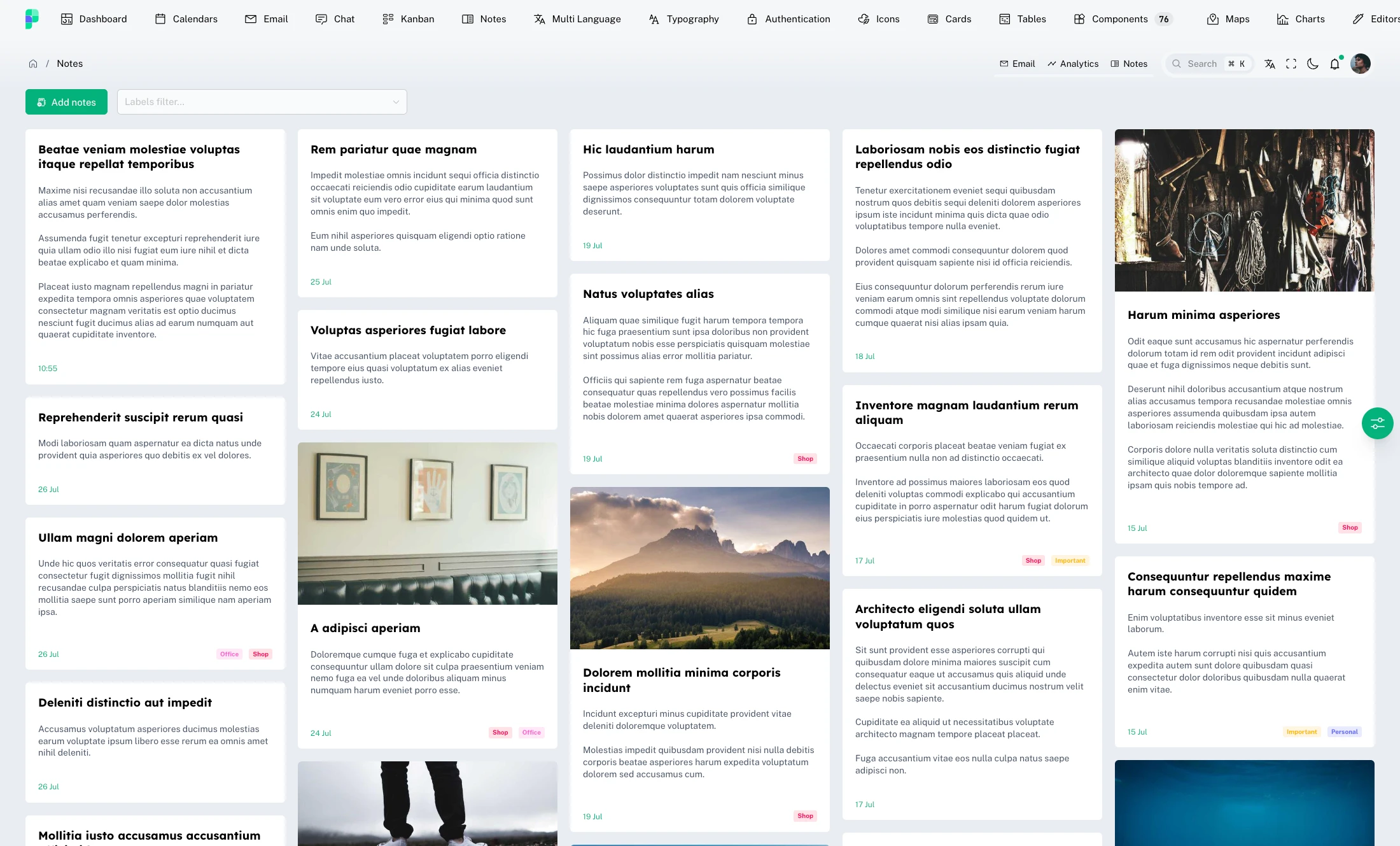
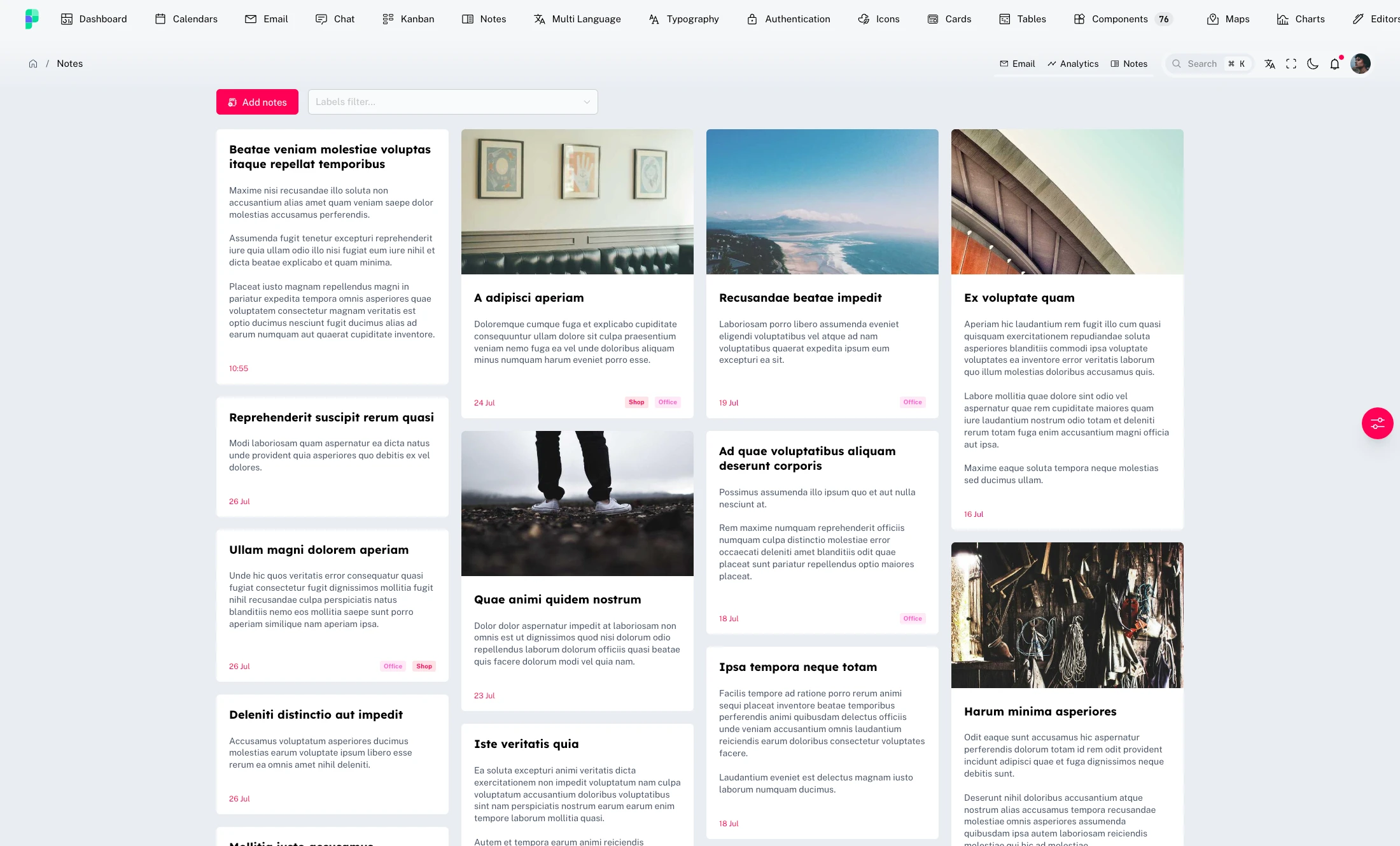
One of the possibilities is the choice between a fluid or fixed-width page. With a fluid-width page, the content dynamically adjusts to the user's screen size, ensuring a more responsive and adaptable experience. On the other hand, the fixed-width page maintains a predefined size, offering greater control over the visual appearance of the application.
Furthermore, there is an option to change the accent color of the entire application. This allows the modification of the predominant color used for key elements, such as buttons, links, and other visual components, providing the opportunity to create a distinctive and consistent design.
Here is a partial list of parameters that you can customize:
layout: VerticalNav, HorizontalNav, BlankthemeName: Dark, LightrouterTransition: animation for page transitionsboxed: choose whether to apply a maximum width to the pagesidebar: this contains a set of customizations for the behavior and appearance of the sidebartoolbarHeight: height of the toolbarborderRadius: normal border radius used on template componentsborderRadiusSmall: small border radius used on template componentsfontSize: font size used on template componentsfontFamily: a set of 3 font-family types shared among template components
The file theme/index.ts contains the complete configuration. Customizing this file allows for extensive variations in the platform's appearance and behavior.